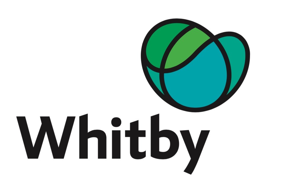
Sault Ste. Marie isn't the only Ontario community struggling with massive grassroots resistance to a municipal logo designed by Toronto-based Scott Thornley + Company Inc.
The Town of Whitby recently retained the same branding consultant and experienced the same overwhelming and vehement rejection that greeted its abstract Sault logo.
Unlike Sault Ste. Marie, Whitby has opted to backpedal on its initial endorsement of the consultant's master logo and brand, opening the door to other ideas.
Whitby has added weeks of additional discussions – ending Friday – to what was already the most extensive community engagement in its history.
Whitby councillors had been told by staff that the new visual identity was overwhelmingly supported, perceived as fresh, vibrant, unique, modern and innovative.
As in Sault Ste. Marie, significant opposition didn't surface so long as the abstract logo was being pitched in private sessions by people involved in its creation.
But the cries of confusion and outrage started as soon as the preferred design was available to the general public.
"Cabbage, snot, brain, curled up jockstrap, not Whitby" were all descriptors spotted on social media by the Whitby This Week newspaper.
An online poll posted the following day on DurhamRegion.com found that just 20 per cent (933) of respondents reported liking the design.
Fifteen per cent (710) said they didn't see "anything Whitby" about it, while 66 per cent (3,126) felt it was time to go "back to the drawing board."
Whitby town councillors decided to do exactly that.
At a meeting two weeks later, they held a freewheeling discussion that included many of the points raised here in the Sault about logo selection:
- the importance of residents being involved in selecting a new town logo
- the creation of a selection committee to evaluate alternate logo designs
- the possibility of an award being provided to the creator of the winning logo design
- the ability to exclude the current brand and create two new branding options with two new logo designs
- conducting additional consultation with the community and capping the costs associated with consultation
- the types of community consultation that could be undertaken
- whether staff could provide an interim report about community engagement tactics
- whether the community could vote to choose the final logo
- the financial benefit of looking at options to modify the proposed logo
- the total costs associated with proceeding with alternative logo designs
- the possibility of incorporating blue and gold into a logo as these colours are common for youth sports teams, youth groups, and schools in the community
- whether staff could report back to refine the total cost of the brand project, including costs for community engagement and consultation
- that abstract logos result in negative feedback initially and that it takes time for people to begin to identify with a logo
- that there has been some positive feedback from community members who have brand experience
- that financial constraints should not influence this process and Whitby’s brand is very important moving forward in order to effectively market and promote the town
"Branding is a challenging exercise," says Matt Gaskell, Whitby's chief administrative officer.
"It is an investment that is about much more than just a logo. Ultimately, it is visual language that communicates a strategic direction and supports economic development and civic engagement."
"A logo is one component of an overall system that only makes sense when reviewed with the brand. In looking specifically at a logo, an important consideration is whether it should be literal or abstract. Specifically, a literal icon offers something we can quickly connect to as it offers a familiar meaning."
"In contrast, an abstract icon makes the audience find meaning and this approach provides brands flexibility to evolve and grow without having to replace the logo. Audiences are less comfortable with things that are unfamiliar mainly because of our need to find meaning in all things. For example, if presented with options, a majority of people will first lean towards universal symbols that can be recognized. Visibility, repetition, time, and support help to build brand awareness."
"Research shows that we invariably have a strong initial reaction to new branding or when a logo changes. The initial reaction to a new corporate brand can be mixed, especially when the change feels personal because of our own connections and perceptions with the community that the branding is seeking to represent," Gaskell says in a report to his Town Council
After Whitby's community consultations end this Friday, results will be compiled and are expected to inform future Town Council decisions on the visual identity campaign.
Here in Sault Ste. Marie, an online petition calling on City Council to reconsider its logo choice has been launched on Change.org.
The proposed design "appears to be a multi-coloured version of a circle, with meanings that are only discovered upon reading the brand standard," the petition states.
"It’s time we ensure our councillors and mayor are acting in behalf of the residents of Sault Ste. Marie, not themselves."
